The Brief
Chaulk believes in the transformative power of architecture to elevate everyday lives. As the studio grows, they needed a brand uplift to better express this philosophy and align with their evolving goals. The refreshed brand and visual identity had to capture the warmth, care, and attention to detail that shines through Founder Kim.
The Solution
We collaborated with Kim to channel her ideas and insights into a refined brand strategy. With this foundation, we developed a visual brand identity that balances playfulness with sustainability and showcases Chaulk’s thoughtful expertise as a creative problem solver.
The Impact
A clear brand strategy has empowered Kim to articulate her offerings, purpose, and goals with precision, providing a solid foundation for future decisions. It served as a guidepost and inspiration for the new visual identity, ensuring cohesiveness and brand strength across all touch-points.

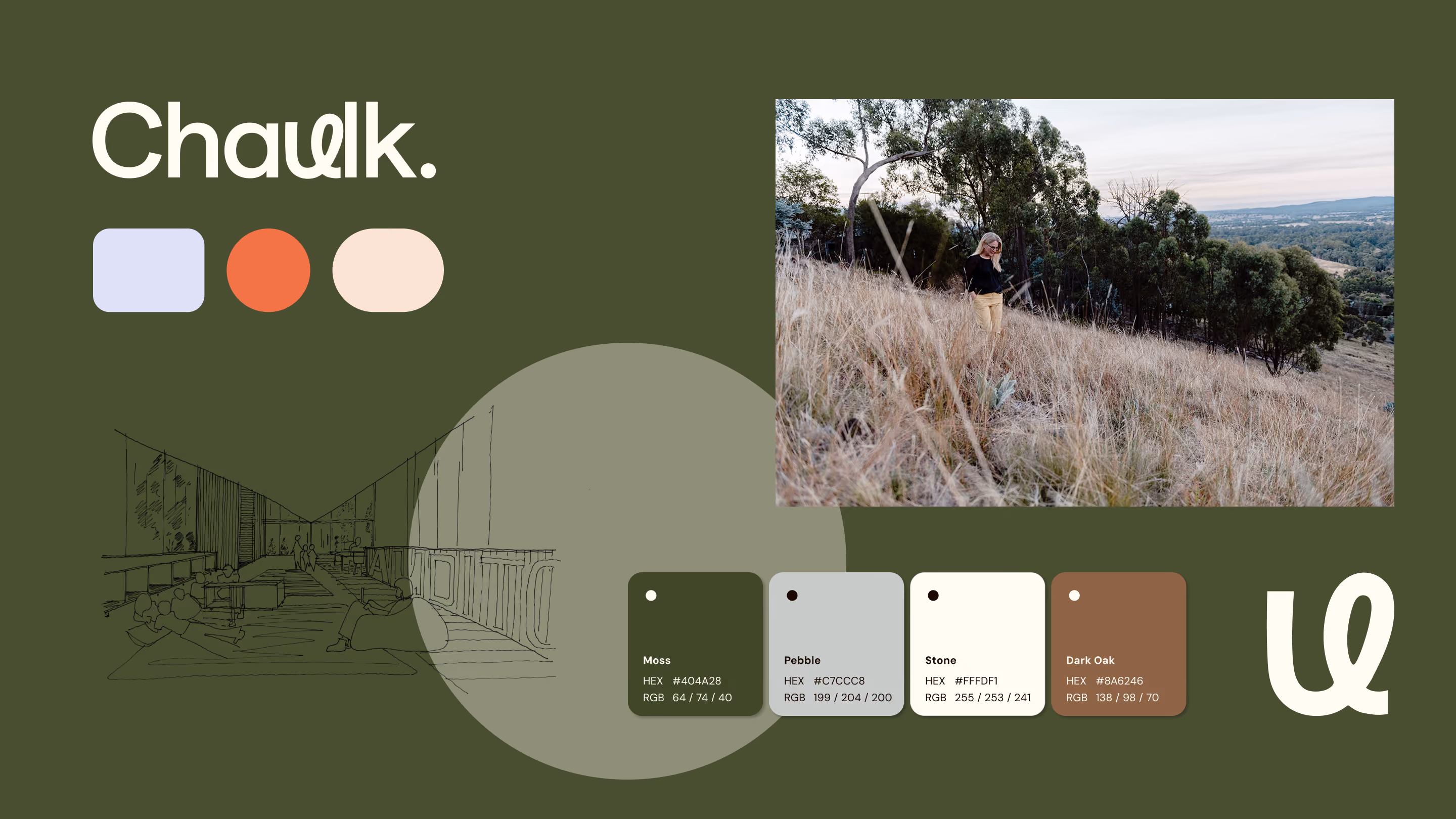
The Logo: ‘U’ at the centre of all that Chaulk does.

Design Philosophy: Rectangles signifies the built environment, the pill shape represents adaptability and the circle represents people thriving.
Highlights
Shaping and supporting the development of brand strategy
Leveraging on Kim’s understanding of her business, we took a collaborative approach to develop a brand strategy that resonated with her vision. We provided Kim with our Google Slide brand strategy template for inspiration, which she completed. Through a series of workshops, we refined the strategy together, clarifying her brand values, solidifying key messages and articulated her purpose: to evoke joy in the ordinary and inspire the extraordinary.
The audience was defined as Institutional leaders, project managers and values-led business owners. Leveraging insights from these groups, we developed key messaged that aligned with their desire for environmentally sustainable design. As well as the need for an expertise to guide end-to-end management of projects to ensure great results within budget.
We shaped her offering into one single sentence: We create inclusive spaces that enable people of all ages, abilities and backgrounds to thrive. Which then lead us into defining her values: Thoughtful & Empathetic, Curious & Brave, Creative & Inventive and Purposeful & Positive.
This brand strategy has given Kim a solid foundation, enabling precise articulation of her offerings and goals while guiding future decisions with consistency and clarity.


Brand colour palette: Earthy tones mixed with vibrant accents.

Imperfect hand drawn illustrations evoking a sense of authenticity

Templates designed with flexibility in mind. A range of versatile layout options designed for future consistency in the application of the brand.
A visual brand identity that connects to strategy and purpose.
The process to create Chaulk's visual identity started with Kim sharing a mood board to clarify her preferences, which guided our research and brainstorming.
We developed two concepts: one highlighting the humanist ‘U’ to symbolise centering clients in everything Chaulk does, and another focused on problem-solving through building block imagery. The first option was chosen for its alignment with the brand's value proposition—evoke joy in the ordinary, inspire extraordinary.
We then refined typography and colours collaboratively in Figma, leading to a polished and cohesive final design.